Is Climate Change the Cause of 2018’s Extreme Weather?
When I first proposed this article the idea was to discuss if the 2018 heatwave and ‘Beast from the East’ periods in the UK were caused by climate change. Since then in Japan more than 300 people have been killed and a further 300,000 hospitalised due to a combination of unprecedented flooding and extreme heat, with the country witnessing its hottest ever day on record (41.1°C). Similarly the strongest super typhoon in nearly a decade, ‘Mangkhut’, struck the Philippines leaving over 120 dead, 93 people were killed by the most deadly wildfires Greece has witnessed in recent decades and 30 lives were lost in Canada during another recent heatwave. All of this comes just six months after many parts of Europe were gripped by the sub-zero temperatures of Beast from the East, and the Met Office issued its first ever red weather warning. Clearly, the weather this year has significantly differed from average weather conditions. Why is that? Is it because of of climate change? If so, how can we tell?
The short answer is: it’s complicated. Assigning a singular weather event such as this summer’s heatwave as an outright consequence of climate change is difficult because ‘climate’ refers to an average or general trend, whereas ‘weather’ describes a singular event or day-to-day variations. For example, the UK has a ‘temperate maritime climate’, meaning temperatures are on average mild (temperate) and the majority of our weather comes from the ocean (maritime), specifically the Atlantic Ocean. As a result, most of the weather we experience in the UK is not freezing cold, but not boiling hot, and unfortunately it is often very wet. Climate change refers to changes in these average or common conditions, hence why attributing it as the cause of a singular weather event that has numerous controlling factors (which is why weather forecasts aren’t always right!), is not technically correct. It would be like using today’s weather to describe the weather over the past year – the two aren’t really comparable because they are over such different timescales.
Perhaps a more useful way of explaining this concept is to use the example of a runner who is training in preparation for their next marathon. You would expect that as the runner progresses through their training, their times and performance will improve. However, from run to run there will be some variation in the runners’ times because there are lots of factors that determine how fast they run, such as how much sleep they’ve had; what they’ve had to eat; if they are ill or not; etc. All of these different controls on the runners’ time are the equivalent of all of the different factors that control the weather we have from day to day, such as wind direction, sea temperature, time of year, etc. For the runner, whilst the overall trend indicates their performance is improving, that does not mean that their times have always increased from one performance to the next, just as whilst our climate is warming that does not mean that temperatures will steadily rise in a linear fashion or that the changes will be the same in every place from day to day.
Apply this scenario to climate change, and the overall reduction in the runner’s times is the overall increase in global temperatures, which have been rising since the end of World War II. Despite this general trend, temperatures have not always increased from year to year, just as the runners’ times would not increase from run to run. Herein lies one of the biggest challenges with climate change – there are so many factors that control global climate, meaning that understanding it is difficult enough, but communicating how it works and what it means for our society in a useful and engaging way is one of the great challenges in science today.
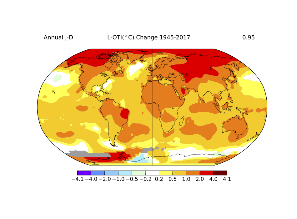
Average global temperatures have increased by 0.95°C since the end of World War 2. Credit: NASA Goddard Institute for Space Studies (GISS)
What is clear in climate change predictions is that the likelihood of extreme weather events, such as those witnessed this year, occurring in the future is increasing as a result of climate change. The Intergovernmental Panel on Climate Change (IPCC) – a group comprising of 194 governments from around the world who brief the United Nations on climate change – stated in their most recent report:
“Changes in many extreme weather and climate events have been observed since about 1950. Some of these changes have been linked to human influences, including a decrease in cold temperature extremes, an increase in warm temperature extremes, an increase in extreme high sea levels and an increase in the number of heavy precipitation events in a number of regions.” 1
At the core of the challenges mentioned in the above statement is the timescale of these changes, which often operate on timescales different to that of our day-to-day lives. Climate change is impacting upon natural systems and cycles that operate on a geological timescale and communicating the relevance of this to a human lifetime is again difficult. Despite this, one method that scientists increasingly deploy is making the problem visual through using colour-based temperature maps. Some examples of these maps have circulated through social media in recent weeks, showing a comparison of global heat maps from June in 1976 and 2018. This is because the last time the UK experienced a heatwave like in 2018 was in 1976:
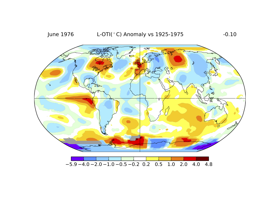
Difference between global average temperatures in June 1976 compared to the 1925 – 1975 global average temperature for June. Credit: NASA Goddard Institute for Space Studies (GISS)
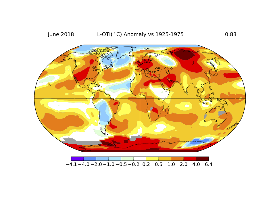
Difference between global average temperatures in June 2018 compared to the 1925 – 1975 global average temperature for June. Credit: NASA Goddard Institute for Space Studies (GISS)
The two maps above are not exactly the same as the ones doing the rounds on social media. Instead they are maps that I produced at https://data.giss.nasa.gov/gistemp/maps/ (anyone can do so, have a go!). They show the temperature anomaly in June 1976 (top) and June 2018 (below) against the average temperature in June between 1925 and 1975. In other words, how different was the temperature in the June’s of 1976 and 2018 compared to the same month from 1925 to 1975. In the 1976 map it is clear that the UK was one of only 4 or 5 very localised areas in the world that were abnormally hot for that time of year. Contrast that to 2018 where the trend is much more widespread, with almost every region of the planet warmer than the 1925–1975 average. This point is reinforced by the overall temperature anomaly given in the top right corner of the map; -0.10°C for 1976 and +0.83°C for 2018, both against the 1925–1975 June average.
Why is this important and how does it relate back to extreme weather? As our world continues to warm many of the physical processes that control our day-to-day weather are impacted and change. Increased average global temperatures mean there is effectively more heat and energy in our weather system, increasing the likelihood, severity, and length of extreme weather. Following the warm summer of 2003, the Met Office looked into the impact of climate change, arising from human activity, on extreme weather. They predicted that by the 2040s the summer temperatures we have experienced this year could be the norm and that subsequent observations of average temperatures are following that predicted trend. Moreover, the heat we experienced this summer would have been a 1 in 1000 event back in the 1950s, now it’s a 1 in 10 event. In short, the increase in global temperatures displayed in the first image mean that what was previously regarded as a weather extreme is becoming less of an extreme and more of a norm.
Whilst the Beast from the East and the summer heatwave were not caused by climate change outright, they very clearly demonstrated just how interconnected our weather systems are. The Beast from the East had its beginnings in the Pacific Ocean. Unusual storm patterns sent waves into the upper atmosphere (known as the stratosphere) and disrupted strong westerly winds called the Polar Vortex, causing it to reverse and collapse. This resulted in cool air from the stratosphere falling into and warming the troposphere (the lowest part of the atmosphere where we and our weather live). What followed was strong winds from the east that pushed cold Siberian air over much of Europe, as opposed to the relatively mild air from the west that usually dominates UK weather. Similarly, this summer’s heatwave persisted because of the northern positioning of the boundary between tropical warm air and cold polar air in the upper atmosphere. Here, air flows from west to east in what’s known as the jet stream, and if positioned over the UK it can act as a sort of conveyor belt for low pressure systems (rainy weather) from the Atlantic Ocean, which can inundate the UK with rain for weeks on end. Due to its position north of the UK, warm air and high pressure (clear, fine weather) from the continent dominated our weather and produced the high temperatures seen so regularly of late. For more information about jet streams and how they influence weather check out this video by the Met Office: https://www.youtube.com/watch?v=Lg91eowtfbw
The impacts of climate change will differ from place to place, but as the Beast from the East demonstrated our weather is intricately interconnected and because of this every consequence of climate change should matter to us all. Whilst the events of the past 8 months have been particularly extreme, the long-term picture is arguably more alarming. Every year since 1992 has seen average annual global temperatures increase compared to the 1945 average (obtained via maps produced using NASA link above). However most importantly, what recent months has show us all is that extreme weather can impact our way of life substantially, even here in the UK. Climate change is increasing the occurrence, severity and length of extreme weather events, therefore climate change is increasing going to impact and disturb us all.
This article was specialist edited by Mary Ann Madsen and copy edited by Sonya Frazier.
Author
References
- 2014 IPCC Climate Change Synthesis Report https://www.ipcc.ch/report/ar5/syr/